






Above the dining table, as a soft point of light in the bedroom or as a sculptural statement in the living room: a modern pendant light often changes the feel of a room more than a new piece of furniture. It defines zones, guides the eye and turns a beautiful interior into a place where you want to linger. What matters is not only the design of the light, but how proportion, light and everyday life work together.
Why pendant lights shape rooms so precisely
Pendant lights bring light closer to the moment it is meant for. Above the table, they light up conversations, meals and work without illuminating the whole room evenly. Next to the bed, they replace classic bedside lamps and keep the surface free. In a tall entrance hall, they give the open space a clear focal point.
In modern interiors this focused effect is especially valuable. A room with low furniture, calm colours and natural materials gains height and tension from a light with a distinctive silhouette. A round opal glass globe feels soft and natural, a folded metal shade looks graphic and urban, and a shade made of paper, rattan or linen feels particularly warm.
A pendant light does not have to be loud to show character. The most beautiful atmosphere often appears when its shape picks up the lines of the room: organic next to soft sofas and ceramics, clearly geometric above a straight-lined dining table, or slightly irregular in a wabi-sabi home.
Choosing the modern pendant light to suit the room
The first thing to consider is always where the light will be used. A light above the dining table has different jobs than one in a reading corner. Once the use is clear, it is easier to make a stylistically consistent choice.
Above the dining table: a centrepiece with pleasant light
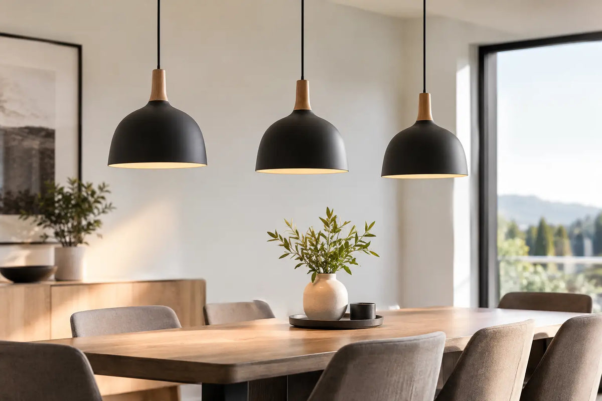
Above the dining table, a pendant light is allowed to have presence. Over a round table, a single voluminous shade or three smaller lights at different heights look especially harmonious. Above a long, rectangular table, two to three pendants or one elongated light create a balanced picture.
As a guide, the shade can take up about a third to half of the table width. This is not a strict rule: a delicate model can be larger, while a very compact, dark light often needs more space or a group of several elements. What matters is that the light makes the table read as a zone without visually overwhelming the people beneath it.
For cosy dinners and long evenings, a dimmable solution makes particular sense. Bright light helps with eating or playing games, and dimmed light makes the same table instantly more relaxed later on. A closed metal shade directs light more precisely downwards, while glass, fabric or paper fills the room more generously with a soft glow.
In the living room: think in layers of light
A pendant light in the living room is rarely the only light source. It works best as part of a lighting landscape with floor, table or wall lights. This creates depth instead of a harsh, centrally lit surface: a soft glow by the armchair, an accent on the sideboard, a calm base mood above the coffee table.
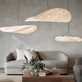
Above a coffee table, a light looks best when it hangs clearly higher than above the dining table. It should frame the seating area, not interrupt the view across the room. Models made of milky glass, light fabric or translucent paper work especially well when the light should flow softly into the room.
Bedroom and bedside: small, fine, deliberate
Hanging lights next to the bed are an elegant alternative to table lamps. They free up space on small bedside tables and give the bed an almost hotel-like calm. Choose a smaller shade here and look for glare-free light. Opal glass globes, linen or fabric shades and compact shapes with warm light feel relaxed and decorative without overloading the room.
The right height decides the effect
Even the most beautiful light can look unsettled if it hangs too high or too low. Above the dining table, a good lower edge is usually about 60 to 75 centimetres above the tabletop. This keeps the light close enough for an intimate atmosphere while preserving eye contact and freedom of movement.
With high ceilings the light can hang a little lower, and with low ceilings or a very large shade it should hang higher. Do not check the height only while seated. Walk around the table, sit in different seats and look into the room from the door. A pendant light is always seen from several perspectives.
In walkways, the lower edge should hang high enough that no one bumps into it. Above a coffee table and in the bedroom it can hang lower, as long as it does not cross walking paths. Height-adjustable cables or systems are practical if the table is moved later or your use changes.
Material and colour: how a coherent overall picture emerges
Materials say a lot about the atmosphere of a home. Travertine, wood, linen, paper and rattan bring natural, tactile calm to Japandi and wabi-sabi interiors. They look especially beautiful next to warm white, sand, taupe, oak and handmade-looking ceramics.
Chrome, brushed metal and glossy glass, by contrast, set a more precise, Italian-inspired accent. They suit dark wood, marble looks, clear mirrors or sofas with a striking shape. Black is ideal when a light should draw a graphic outline. Brass and brushed gold add warmth, but should be deliberately repeated in the room, for example in handles, picture frames or small home accessories.
A mix of materials is quite welcome, as long as one element takes the lead. If the table, chairs and floor already have a lot of wood grain, a glass or metal light creates a beautiful contrast. If the room is rather cool and minimalist, a fabric or paper shade can bring the missing softness.
Do not treat light colour and bulbs as an afterthought
Light colour shapes the mood at least as strongly as the shade. Warm white light of around 2,700 Kelvin feels homely and flatters wood, textiles and skin tones. For a kitchen or a table that also serves as a workspace, a slightly more neutral shade of around 3,000 Kelvin can make sense. Very cool light quickly makes living spaces feel clinical and usually suits functional areas better.
Also pay attention to whether the bulb is visible. With open shades, a decorative filament bulb becomes part of the design. With opal glass or closed lights, an even distribution of light comes first. Dimmable light is worthwhile wherever a room plays several roles - especially in living and dining areas.
Common mistakes and how to avoid them
Many pendant lights look smaller in the shop than at home. Measure the table, room height and shade diameter before buying, and mark the size on the ceiling with paper or cardboard as a test. This removes uncertainty and shows immediately whether a single statement piece or several smaller pendants fit better.
Another common mistake is to plan only a ceiling light. Even an exceptional pendant light cannot carry a cosy lighting mood on its own. Complement it with at least one lower light source, such as a table lamp on the sideboard or a floor lamp next to the sofa. In the evening this creates shadow, depth and the relaxed atmosphere that makes modern rooms so inviting.
A clash of styles is not automatically a problem either. An organic light above a strictly straight-lined table can be exactly what gives it its special appeal. It becomes less convincing only when shape, material and light colour all work against each other at once. So repeat a colour, a soft line or a material note elsewhere in the room.
A well-chosen pendant light accompanies not only your furnishings but your everyday life: the first light in the morning, the laid table in the evening, the quiet hour on the sofa. Choose a shape that still gives you joy when it is switched off - because good design stays visible long after the light goes out.

Leave a comment
This site is protected by hCaptcha and the hCaptcha Privacy Policy and Terms of Service apply.